Landing Page Optimisation Examples: 7 Roofing Lessons
A homeowner finds water dripping through the ceiling, searches for roof repairs, and clicks your ad. Your page opens with a large roof photo, but the phone number is buried, the form asks for five fields, and nothing confirms you cover their suburb. They go back to search before your phone rings.
You’ve paid for the visit. You haven’t made the next step clear enough.
Small page decisions affect whether a paid click becomes a call. A visible phone number, a service-specific headline, and a clear explanation of what happens after an enquiry can matter more than a polished redesign. The challenge is choosing which change deserves your time, then measuring whether it brings suitable roofing jobs.
The same expectation-setting principle applies across home services. Someone reading what to expect from pest professionals wants to understand the service before making contact. Your roofing customer needs that reassurance too.
These landing page optimization examples include an agency service, visual galleries, and published case studies. They serve different purposes, but each offers a practical test for your quote-request page, with the design, copy, and tracking changes spelled out.
Table of Contents
- 1. Website Design
- 2. Unbounce - Landing Page Optimization Case Studies
- 3. Unbounce - Customer Landing-Page Examples
- 4. HubSpot - 36 Landing-Page Examples and Conversion Ideas
- 5. CXL - TruckersReport Landing-Page Case Study
- 6. Instapage - RealtyShares Case Study
- 7. DataStory NZ - Chomp Lead-Generation Case Study
- How the seven landing page sources compare
- Turn These Examples Into Your Next Roofing Page Test
1. Website Design
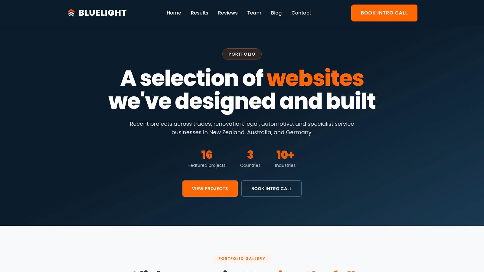
Best for roofing owners who need implementation, not another inspiration folder. Our website design service is built around roofing enquiries, rather than a general-purpose visual refresh. Layouts can reflect re-roofing, repairs, metal and tile roofing, gutters, and restoration, with calls and quote requests as the main actions.
That distinction matters when your advertising promises a specific service. Someone searching for a tile roof repair shouldn’t have to search a broad company homepage to discover whether you do that work. We connect conversion layouts with roofing-focused Google Ads, call tracking, and form tracking so enquiries can be measured alongside the traffic that generated them.
Test a service-specific opening screen
Take a repair campaign that currently sends visitors to your homepage. Build a focused alternative with a repair headline, your genuine service area, a relevant project photo, and a prominent phone action.
- Design change: Put the phone number and quote action before the company history. Keep the opening image compact enough that mobile visitors can see the next step.
- Copy change: Explain which roof problems you inspect and what happens after someone contacts you. Don’t promise emergency availability unless you provide it.
- Tracking change: Record completed forms and connected calls separately, then label enquiries by service, location, and suitability.
The advantage is roofing-specific execution that can match your advertising. The limitation is that the service page doesn’t detail design packages, pricing, project examples, or timelines, and its roofing focus won’t suit unrelated businesses.
Service boundaries deserve attention too. A directory offering to get matched with insured exterminators makes a particular promise about who the visitor will reach. Your page should be equally clear about whether they’re contacting your roofing company directly and which areas you serve.
Practical rule: Make the page useful before making it impressive. A homeowner should understand the service, coverage, and contact route without searching through your navigation.
Choose this route when the existing page needs structural work. If you can already edit the layout confidently, the resources below offer less involved ways to develop test ideas.
2. Unbounce - Landing Page Optimization Case Studies
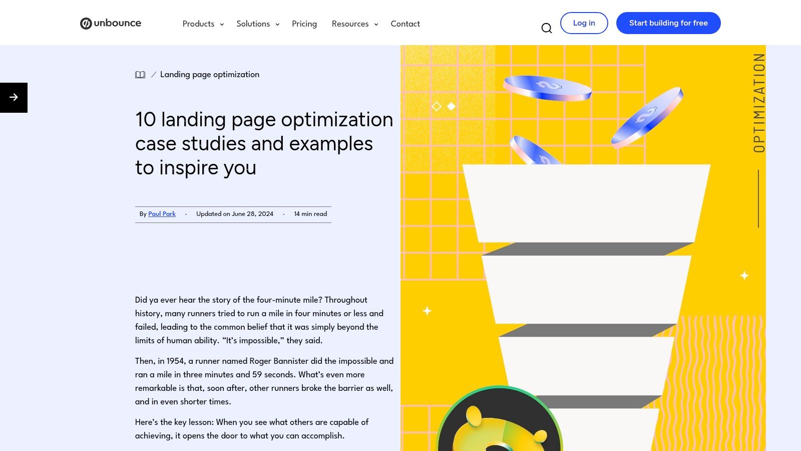
Published experiments are more useful than attractive screenshots when you want to understand what changed and why. Unbounce’s free collection of ten optimisation case studies covers calls to action, search-intent matching, audience-specific pages, and mobile usability. Each example connects a challenge with a change and a reported outcome.
Its strength is the reasoning. You can inspect an experiment without an account and turn it into a hypothesis for your own page. Its weakness is transferability: most examples aren’t home services, and published summaries may not disclose enough about traffic or test conditions to judge the result independently.
Test the match between the search and headline
Say your ad targets re-roofing, but the page opens with a broad statement about quality roofing solutions. Change the headline to identify re-roofing and the area you serve, then explain how you assess repair versus replacement.
Leave the form, images, and offer unchanged during this test. Otherwise, you won’t know whether clearer wording helped or whether another change caused the difference.
- Design: Keep the service headline and supporting explanation visible before unrelated services.
- Copy: Describe the customer’s next decision, not just your company’s values.
- Tracking: Compare qualified replacement enquiries and booked inspections by page version, not button clicks alone.
The measurement distinction is important. Affilino’s New Zealand lead-generation example reports a GA4 user key-event rate increase from 8.18% to 12.66%, but that metric isn’t necessarily a completed quote-request rate.
Treat published outcomes as evidence that a test was worthwhile for that business. Don’t turn them into a forecast for your roofing campaign.
3. Unbounce - Customer Landing-Page Examples
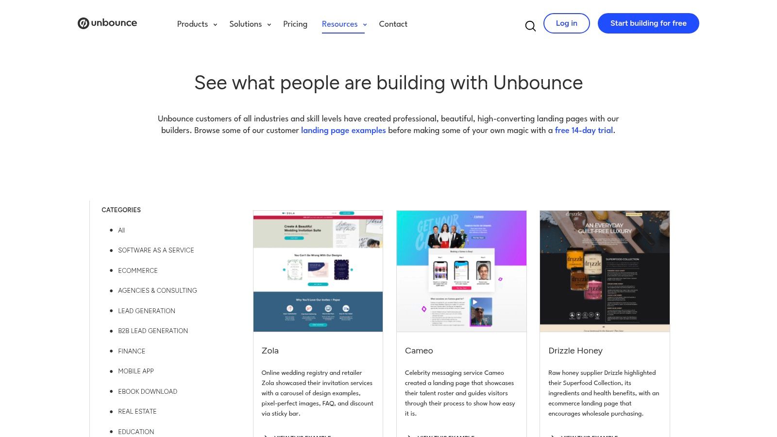
Open your quote page on a phone and compare its opening screen with the Unbounce customer landing-page gallery. The free gallery includes lead-generation and trades-and-services categories, making it useful for studying page structure, offers, and call-to-action placement.
Unlike the case-study collection, this is visual inspiration, not a performance ranking. You can quickly compare different layouts, but conversion results aren’t provided for every page. An attractive example earns a place in your test backlog, not an automatic rebuild.
For roofing, I’d use it to examine where the strongest evidence appears. A recent local project or relevant customer review may deserve space ahead of a long introduction about the business.
Test relevant reviews beside the quote form
Thryv’s 2025 Australia–New Zealand consumer report found that 81% of New Zealand consumers always or sometimes check reviews before purchasing from a small business, while 28% are deterred by no or too few reviews.
That supports testing review visibility, not inventing proof or assuming a large carousel is best.
- Design change: Move an authentic, service-relevant review beside the form, with a corresponding project photo where permission allows.
- Copy change: Preserve the customer’s wording. Add factual context such as roof type, suburb, and work completed without changing what they said.
- Tracking change: Compare completed enquiries and qualified calls against the existing review placement.
A small collection of relevant, authentic reviews is worth testing against a larger block of generic praise. Relevance is the hypothesis, not a guaranteed winner.
If your review base is limited, use genuine project details to answer practical questions. Don’t conceal the source, exaggerate the volume, or manufacture customer language.
4. HubSpot - 36 Landing-Page Examples and Conversion Ideas
A quote button asks for commitment. The words beside it should explain what that commitment involves.
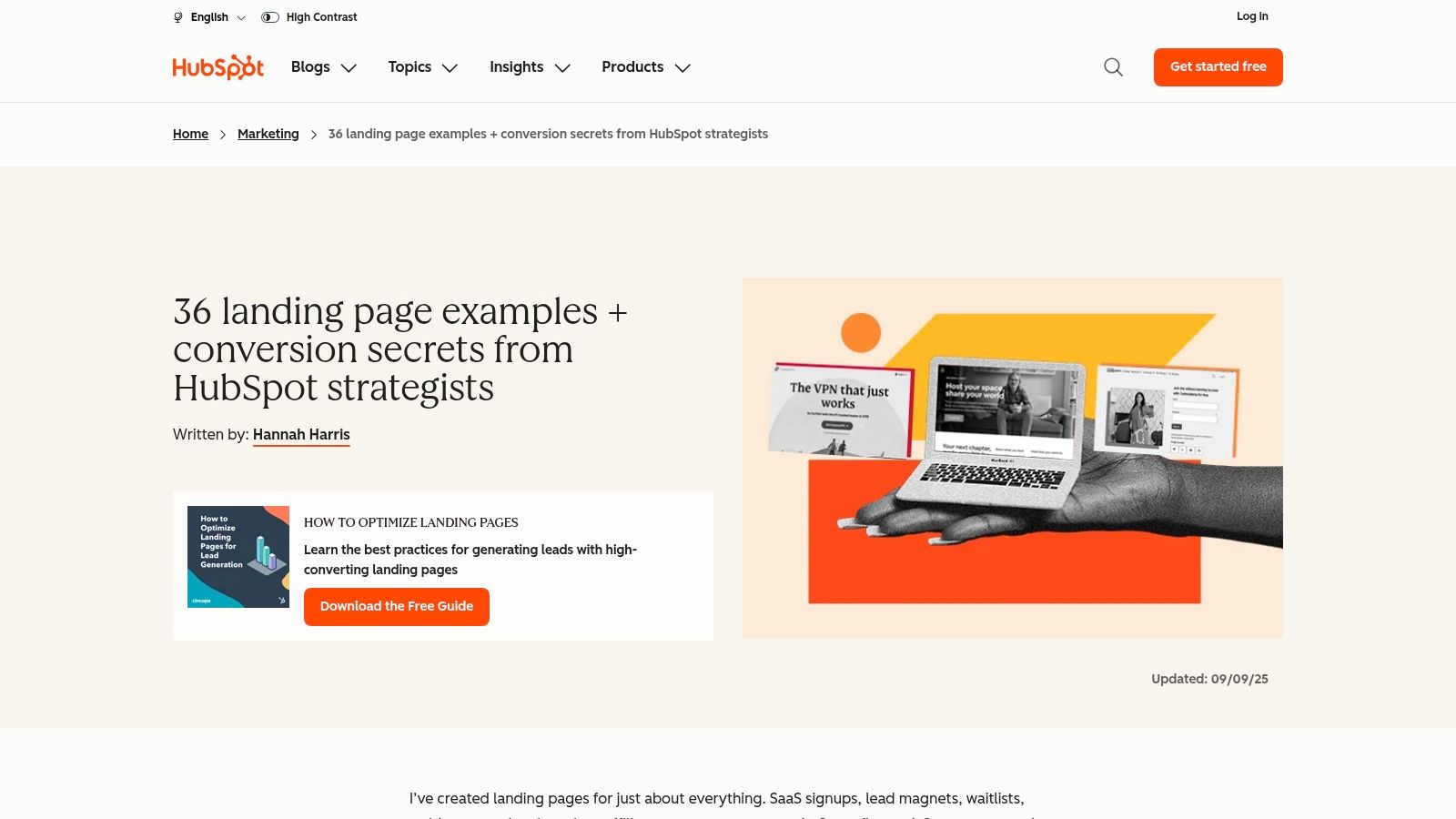
HubSpot’s roundup of 36 landing-page examples, updated in September 2025, offers accessible commentary on clear offers, audience-specific messaging, and reducing uncertainty around calls to action. It’s free and broad enough to help an owner spot copy problems without learning specialist terminology.
The trade-off is context. Many examples aren’t paid-search lead-generation pages, so borrowing a software trial offer or download layout directly would miss the point. Use the explanations to identify unanswered questions, then compare them with roofing landing-page examples before changing your own page.
Test the explanation beside your button
Keep your current form and layout. Replace vague reassurance with an accurate description of the next step: who contacts the customer, what information you need, and whether an inspection is required before quoting.
For a leak-repair page, explain that you’ll assess the source rather than assume the entire roof needs replacing. Stats NZ’s Housing in Aotearoa 2020 assessment found that 47% of surveyed dwellings had roofs in excellent or good condition, while 11% had roofs rated serious or poor.
- Design: Place the explanation immediately beside the quote action.
- Copy: Distinguish an enquiry from a confirmed booking. Don’t imply an instant price if you need to inspect.
- Tracking: Measure completed requests, booking acceptance, and enquiries from people expecting a different service.
This test addresses uncertainty rather than appearance. It may help you attract better-prepared customers even if the total enquiry count barely changes.
5. CXL - TruckersReport Landing-Page Case Study
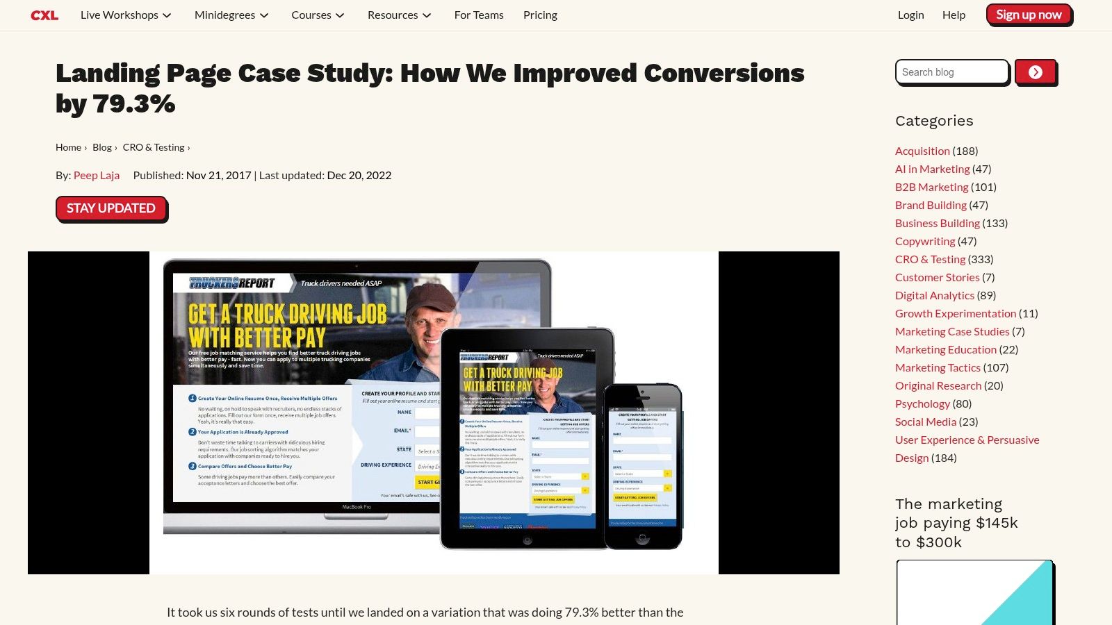
Don’t assume a redesign is an improvement. CXL’s 2017 TruckersReport case study describes six rounds of testing on a truck-driver application page and reports a 79.3% improvement over the original.
The useful lesson is iteration. Recruitment differs from roofing, and the result belongs to that campaign, but the lead-generation setting makes the testing process worth studying. It shows why successive changes can be more informative than approving an entirely new design on appearance alone.
Mobile deserves its own inspection. Energise’s summary of Digital 2025 New Zealand states that 94% of New Zealand internet users accessed the web through smartphones in 2024.
Test a usable mobile contact route
Compare your existing mobile page with a version that keeps the call action easy to reach. Don’t let a fixed contact bar cover form fields, error messages, or privacy information.
Start with the tasks a stressed homeowner needs to complete: read the service area, call the business, or send an enquiry. Use visible field labels, clear keyboard focus, readable contrast, and errors that explain how to fix a problem.
Measure the outcome: A tap on the phone number is an attempted contact. An answered, suitable enquiry is the business result.
Track phone taps separately from connected calls, and record form starts separately from successful submissions. Check the page on an actual handset, including the experience with the keyboard open.
The roofing landing-page best-practices guide provides a useful companion for reviewing service relevance and contact placement. Use those principles to choose a change, then let your own enquiry quality determine whether you keep it.
6. Instapage - RealtyShares Case Study
A property manager arranging maintenance doesn’t need the same opening message as a homeowner dealing with an active leak. Audience-specific pages let you answer different questions without crowding everything onto one screen.
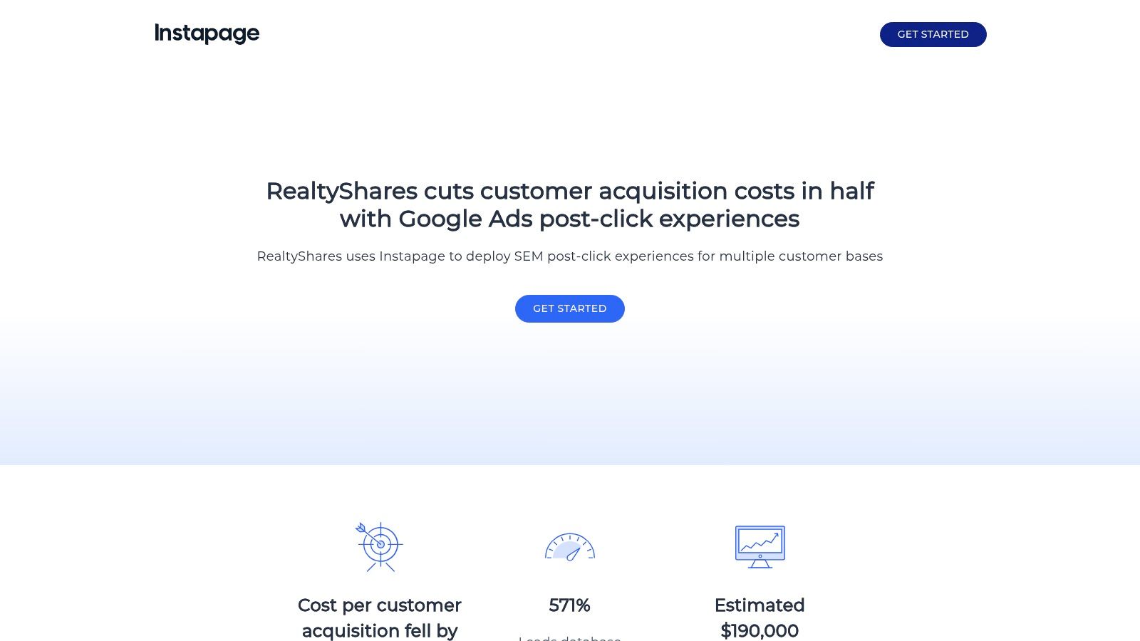
Instapage’s RealtyShares case study reports 96 page experiences, a doubled conversion rate, acquisition costs cut in half, and lead-database growth of 571%. Those are company-reported outcomes from real-estate investing, not a sensible page-production target for a local roofer.
The free case study is useful for understanding how campaign messages connect with the page visitors see after clicking. Its limitation is scale: maintaining numerous variants can become impractical when your team needs straightforward quoting and clear reporting.
Test an audience split you can maintain
Start with a genuine difference in customer needs. A homeowner page can explain the assessment and repair-versus-replacement recommendation; a property-manager page can explain access arrangements, inspection records, and maintenance planning.
- Design change: Reuse the same page structure, but change the opening content and relevant project evidence.
- Copy change: Address the customer’s responsibilities. Mention tenant coordination only if your team can handle that process.
- Tracking change: Record audience type, authority to approve work, service area, and whether the enquiry becomes an inspection.
Stats NZ’s housing-quality figures show that dampness was reported at least some of the time in 13.1% of owned dwellings versus 29.2% of non-owned dwellings in 2023. That doesn’t establish a roofing cause, so avoid claiming that roofing work will resolve every moisture problem.
Choose manageable relevance over mass personalisation. Keep variants only when they answer a distinct need and attract suitable work.
7. DataStory NZ - Chomp Lead-Generation Case Study
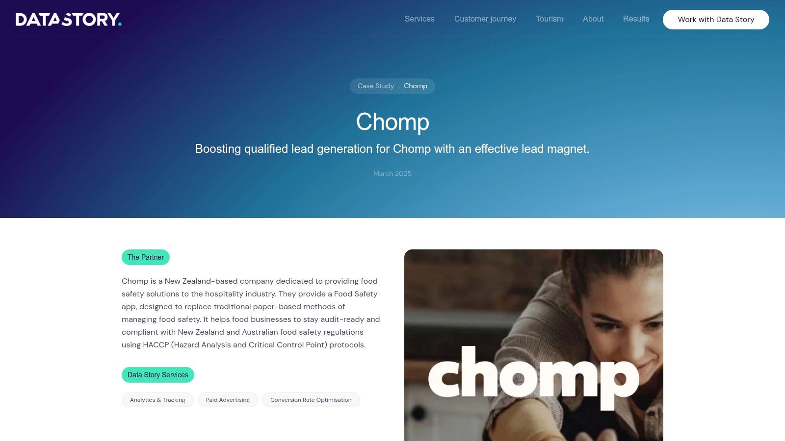
A clear offer and a straightforward form are worth testing before a full rebuild. DataStory’s Chomp case study reports 53 qualified leads from 159 visits over 13 days, alongside a 20.7% conversion rate.
Those reported figures shouldn’t be treated as a single, self-explanatory calculation. The page’s stated conversion rate doesn’t directly equal qualified leads divided by visits, so don’t use it as a roofing benchmark without understanding the measurement definitions.
The practical attraction is the New Zealand lead-generation context. The campaign promoted a downloadable guide with a focused explanation and a simplified capture form. Its limitations are the small sample, short timeframe, provider-reported results, and an offer that requires less commitment than arranging roofing work.
Test removing unnecessary form work
Inspect every field on your quote page. Keep information you need to contact the customer and check whether the job fits; defer details that can wait until the follow-up.
- Design: Make photo uploads optional and keep labels visible after visitors begin typing.
- Copy: Explain why you need the suburb and job description. Replace vague errors with instructions that identify the problem.
- Tracking: Compare form starts, completed submissions, contactable leads, and booked inspections.
Don’t remove useful qualification just to make the form shorter. A suburb field can prevent wasted quoting, while a mandatory detailed roof measurement may ask for information the customer can’t provide.
The strongest takeaway is offer clarity, not form minimalism. A visitor should know whether they’re requesting advice, an inspection, or a quote, and what your team will do next. Judge the change by useful conversations rather than a busier inbox.
How the seven landing page sources compare
| Item | Resource Type | Best For | Access |
|---|---|---|---|
| Website Design | Roofing website design service | Roofers seeking service-focused pages designed to encourage calls and quote requests | Visit Bluelight |
| Unbounce, Landing Page Optimization Case Studies | Case study collection | Finding practical landing-page testing ideas and examples | Free to read |
| Unbounce, Customer Landing-Page Examples | Examples gallery | Browsing landing-page layouts, offers, and calls to action | Free to browse |
| HubSpot, 36 Landing-Page Examples and Conversion Ideas | Examples roundup and guide | Generating landing-page copy and design ideas | Free to read |
| CXL, TruckersReport Landing-Page Case Study | Landing-page case study | Learning from iterative testing and mobile usability improvements | Free to read |
| Instapage, RealtyShares Case Study | Paid-campaign landing-page case study | Exploring audience-specific pages and campaign-to-page matching | Free to read |
| DataStory NZ, Chomp Lead-Generation Case Study | Lead-generation case study | Reviewing a targeted campaign with a focused offer and simple form | Visit case study |
Turn These Examples Into Your Next Roofing Page Test
Choose a page that already receives paid clicks. Don’t start with a quiet service page just because it’s easier to edit. Open the chosen page on your phone and check whether a customer can identify the service, confirm the area, and contact you without hunting.
Pick a meaningful change from these examples. Move the phone number into the opening screen, make the headline match the advertised service, place a relevant review beside the form, or remove a field you don’t need before calling back.
Write down why you expect the change to help. That keeps the test focused on a customer problem rather than personal design preferences.
- Establish the starting point: Record paid visits, completed forms, connected calls, qualified enquiries, and booked inspections.
- Run a fair comparison: Split comparable traffic between the current page and the alternative where your setup allows. Keep the offer, targeting, and tracking consistent.
- Allow enough time: Run the test for at least a few weeks, and longer when enquiry volume is low. Elapsed time alone doesn’t establish a reliable result.
- Review lead quality: Check service fit, location, contactability, and booking outcomes before declaring a winner.
Avoid changing bids, targeting, the form, and the headline together unless you’re deliberately testing a complete replacement. If everything moves at once, you may improve results without learning which change helped. Also check for broken submissions and tracking errors before interpreting a sudden rise or fall.
Use cost per qualified enquiry as a decision measure, with booked work as the commercial check. A page that attracts more unsuitable enquiries can leave your team busier without improving the pipeline. Deduplicate customers who both call and submit a form so you don’t count the same opportunity twice.
If you’re unsure where to begin, use the free 30-minute ad account review to identify what’s working, where budget is leaking, and which page changes could move the numbers fastest. The roofing ads report can help frame the wider campaign, the ROI calculator can clarify the economics, and the case studies can help you assess the connection between enquiries and revenue.
Bluelight builds roofing-focused Google Ads systems and landing pages designed to turn relevant visits into calls and quote requests. Visit Bluelight to book your free ad account review and identify the most useful test for the page your advertising sends customers to.
Related service Google Ads for Roofers