Website Transformations

Most projects here compare an older website with the finished rebuild. For businesses that started without any previous website, the left panel shows the starting point instead. The after side uses real Bluelight builds.

Roofing

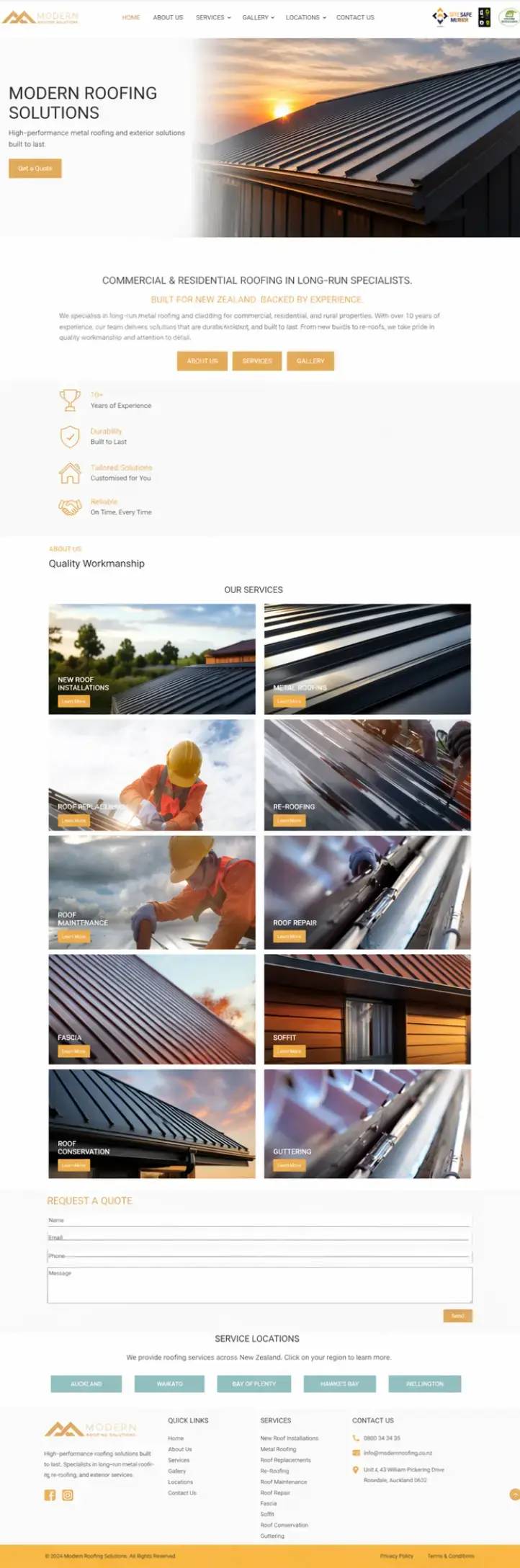
Modern Roofing

A shift from a flat brochure-style presence to a stronger premium trade brand with better hierarchy, stronger contrast, and a more confident first screen.

Cleaner premium positioning
Before
Before website preview for Modern Roofing
  • Weak visual hierarchy and little sense of quality.
  • Generic blocks that do not support premium pricing.
  • CTA feels buried instead of obvious.
  • Sharper brand feel with stronger trust cues above the fold.
  • Better content pacing and more deliberate lead-generation flow.
  • Visual finish supports a more credible first impression.
Visit live site ↗
Roofing

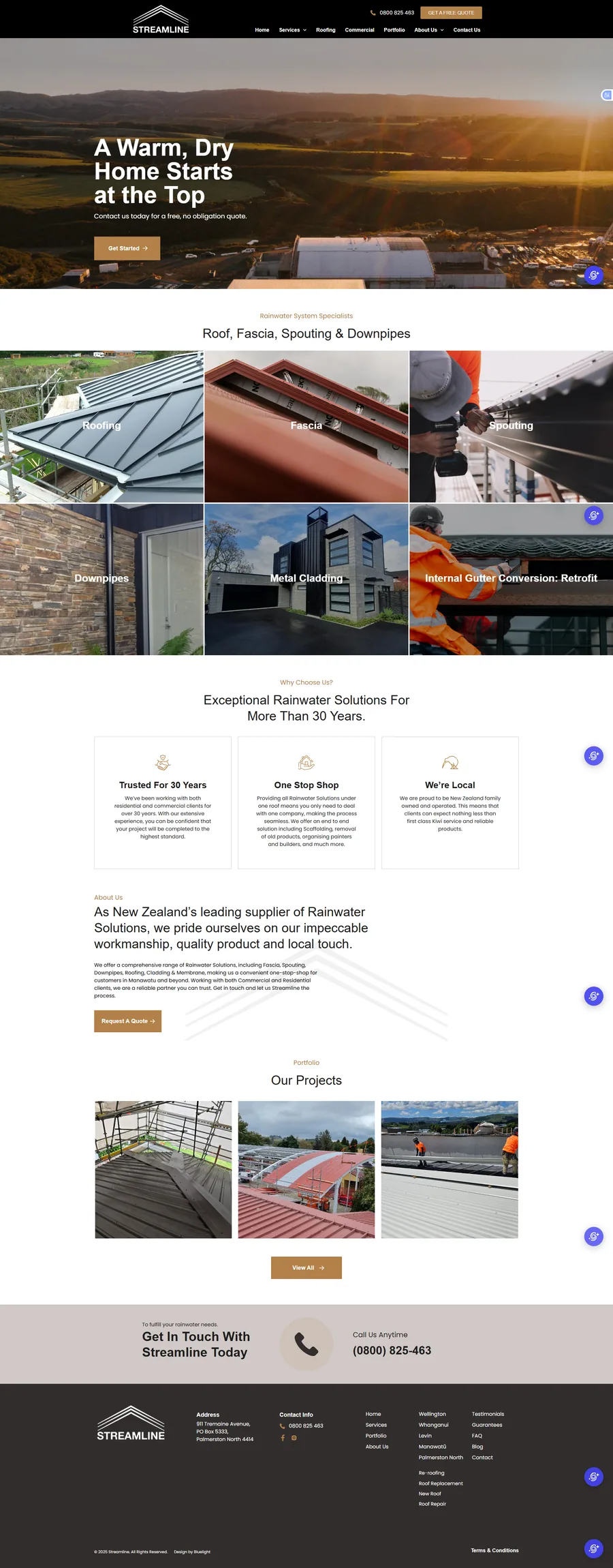
Streamline Roofing

A capable service-led website rebuilt into a stronger lead-generation experience, with sharper positioning, more persuasive proof, and a much faster path from first impression to quote request.

From service site to lead engine
Before
Before website preview for Streamline Roofing
  • Services are visible, but the hero message does little to differentiate the business.
  • Proof relies mostly on broad experience claims rather than customer evidence.
  • Quote intent is handled through buttons alone, without an inline form to capture demand immediately.
  • A specific headline communicates the complete roofing offer immediately.
  • Reviews, finance options, guarantees, and project imagery build trust throughout.
  • An above-the-fold quote form and repeated phone CTAs make the next step obvious.
Visit live site ↗
Roofing

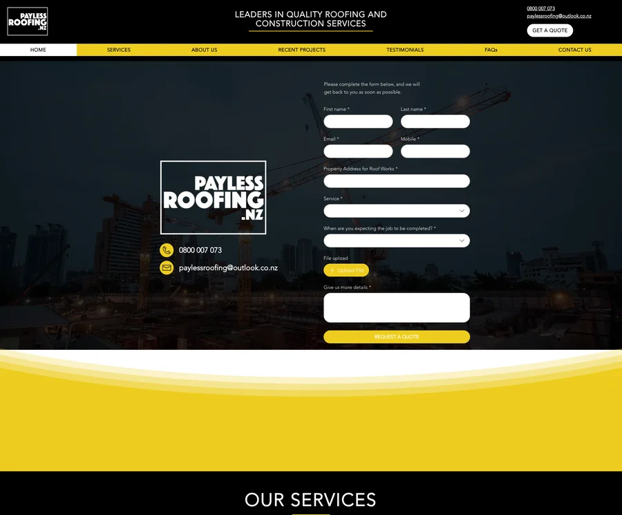
Payless Roofing

A move from a Wix site that opened with a nine-field form to a page that leads with position, proof and accreditation, then asks for the quote once it has earned it.

Proof before the form
Before
Before website preview for Payless Roofing
  • The first screen is a nine-field quote form, asked before the business has made its case.
  • “Roofing and construction services” blurs the offer, and the services themselves sit behind a dropdown.
  • Trading since 2014, 950+ projects and a 4.8 Google rating are all buried well below the fold.
  • A location-led headline and named services make the offer legible in the first screen.
  • Accreditations, review score and the 10-year workmanship guarantee sit with the primary CTA.
  • The same proof now opens the page, and each service has its own imagery and pathway.
Visit live site ↗
Renovation / Design

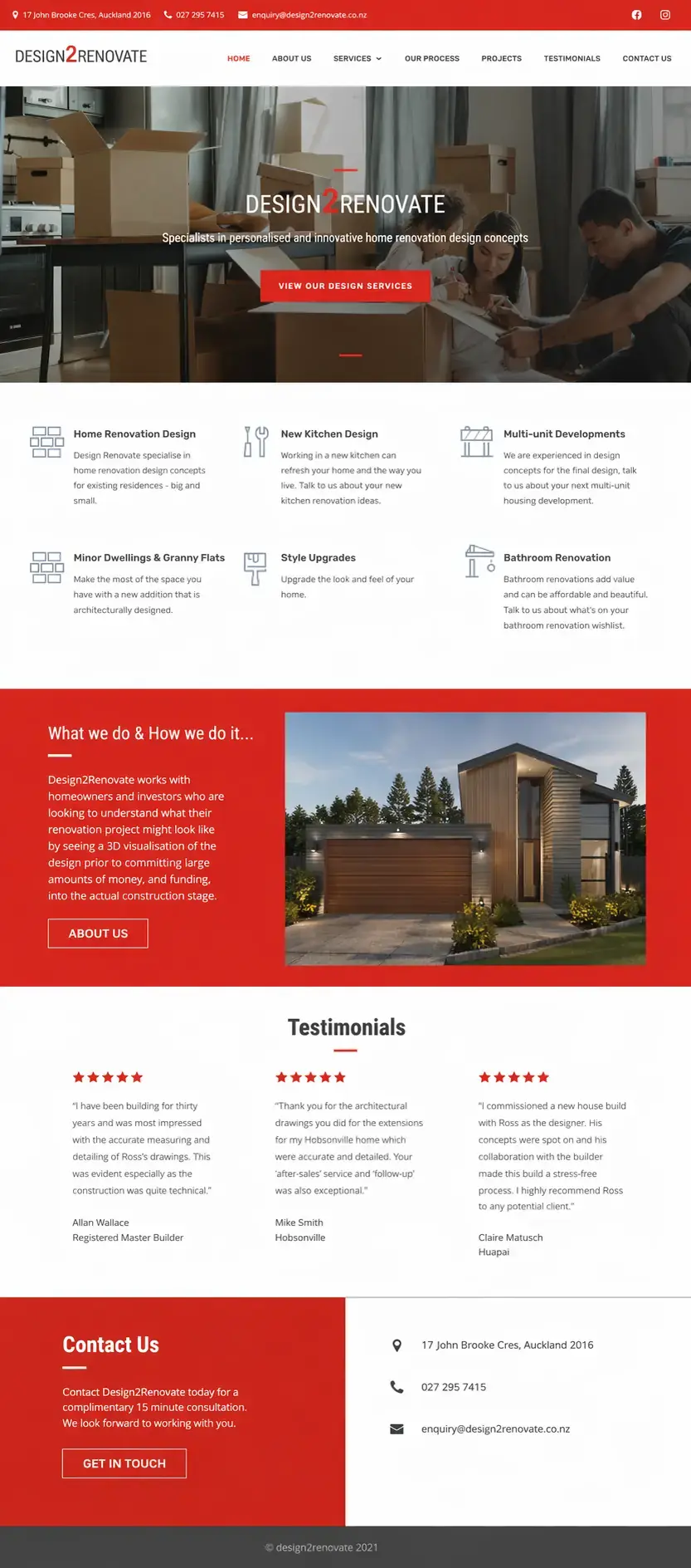
Design2Renovate

This example shows how a renovation business can move from a busy, mixed-message homepage to a more polished layout that feels intentional and easier to trust.

Less clutter, more confidence
Before
Before website preview for Design2Renovate
  • Too many competing elements too early in the page.
  • Brand message feels diluted and visually inconsistent.
  • Not enough contrast between supporting info and the main CTA.
  • More deliberate structure with a calmer, higher-trust layout.
  • Project imagery feels better framed and more premium.
  • The business story reads faster for cold traffic.
Visit live site ↗
Renovation

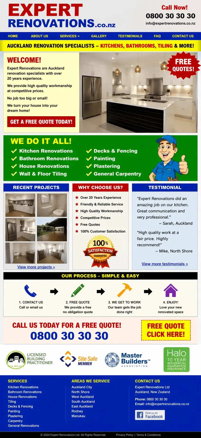
Expert Renovations

Renovation companies often need a better balance of inspiration and trust. This kind of upgrade helps the business feel more capable and more design-aware.

Before
Before website preview for Expert Renovations
  • No polished online platform to showcase renovation projects.
  • Potential clients had little to review before making contact.
  • The brand needed a stronger first impression from day one.
  • The finished page feels more considered and more premium.
  • Project-led storytelling is clearer and easier to trust.
  • Stronger finish supports better perceived value.
Visit live site ↗
Bathrooms / Renovation

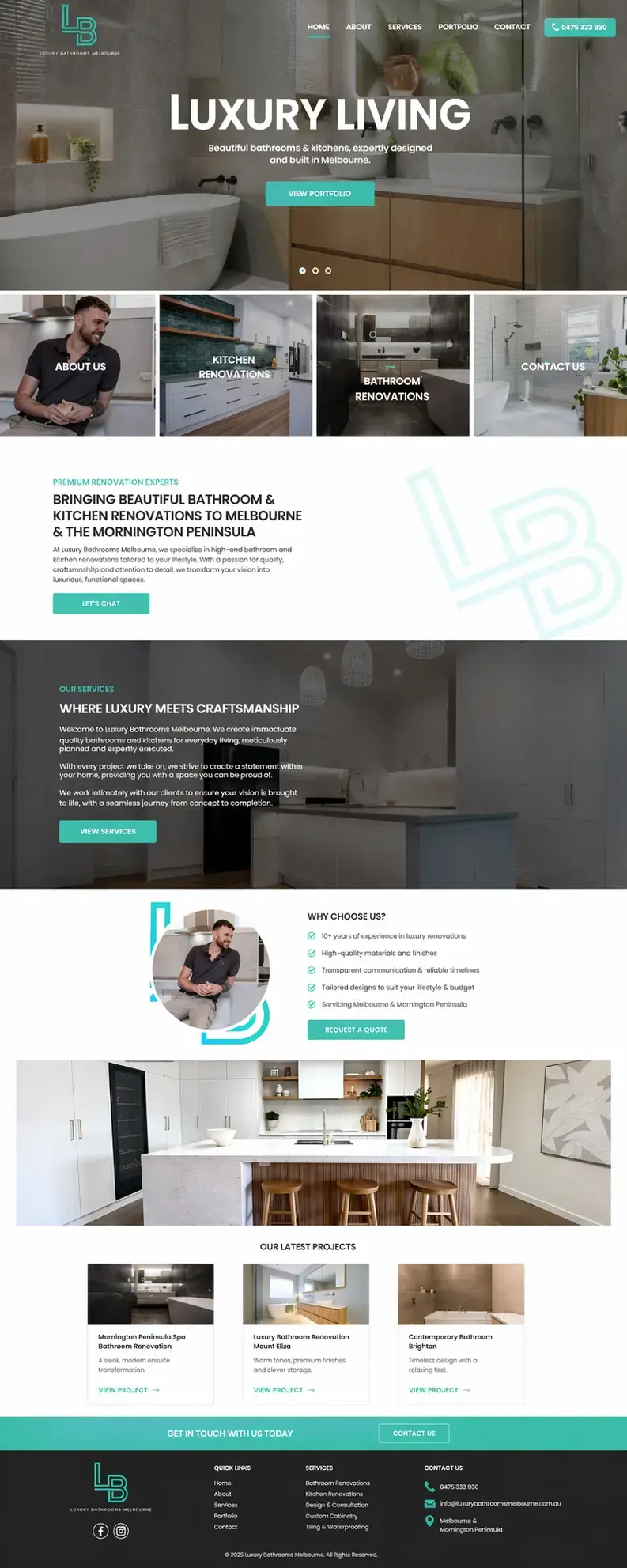
Luxury Bathrooms Melbourne

High-end residential services need a more aspirational presentation. This style of rebuild helps justify better clients, better projects, and better perceived quality.

Stronger premium appeal
Before
Before website preview for Luxury Bathrooms Melbourne
  • Offer quality feels lower than the actual service level.
  • Imagery and layout do not fully support premium positioning.
  • The brand lacks the visual confidence luxury clients expect.
  • Much stronger visual fit for a premium renovation audience.
  • Project work feels better framed and more desirable.
  • The site now supports higher-end expectations.
Visit live site ↗
Joinery / Kitchens

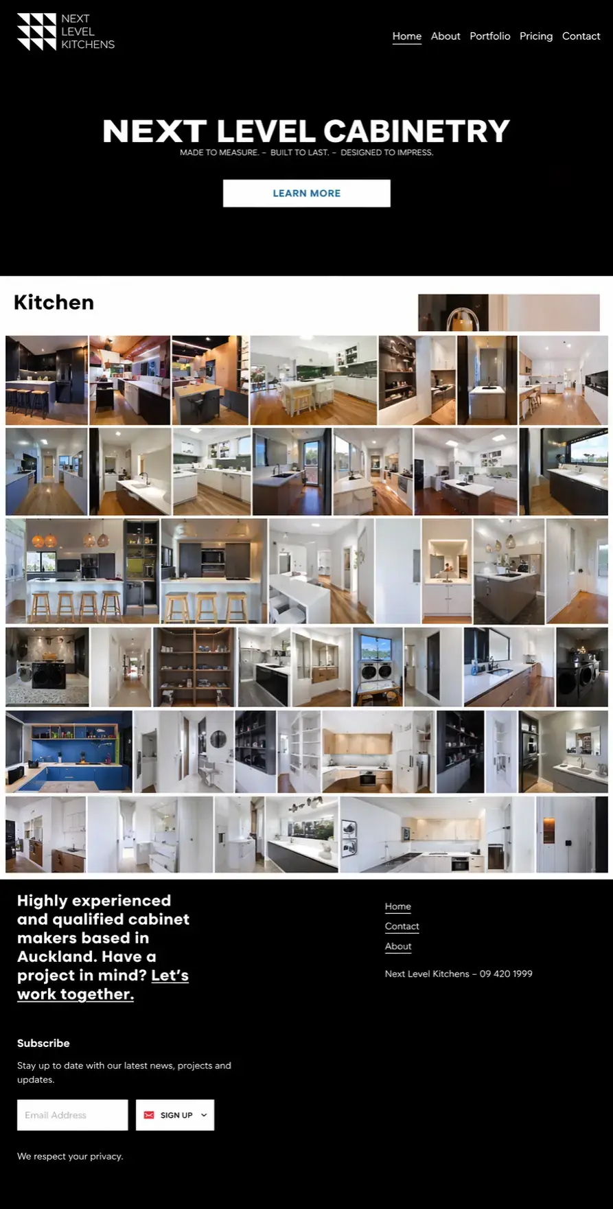
Next Level Kitchens

A good example of taking a practical local business and giving it a more aspirational web presence without losing clarity or quote intent.

Higher-end residential feel
Before
Before website preview for Next Level Kitchens
  • Feels utilitarian rather than premium and design-led.
  • Project examples do not carry enough visual weight.
  • Weak emotional connection for higher-value homeowners.
  • Visual direction now supports higher-ticket kitchen enquiries.
  • Imagery, whitespace, and typography feel more considered.
  • The offer reads more like a specialist studio than a generic contractor.
Visit live site ↗
Property Maintenance

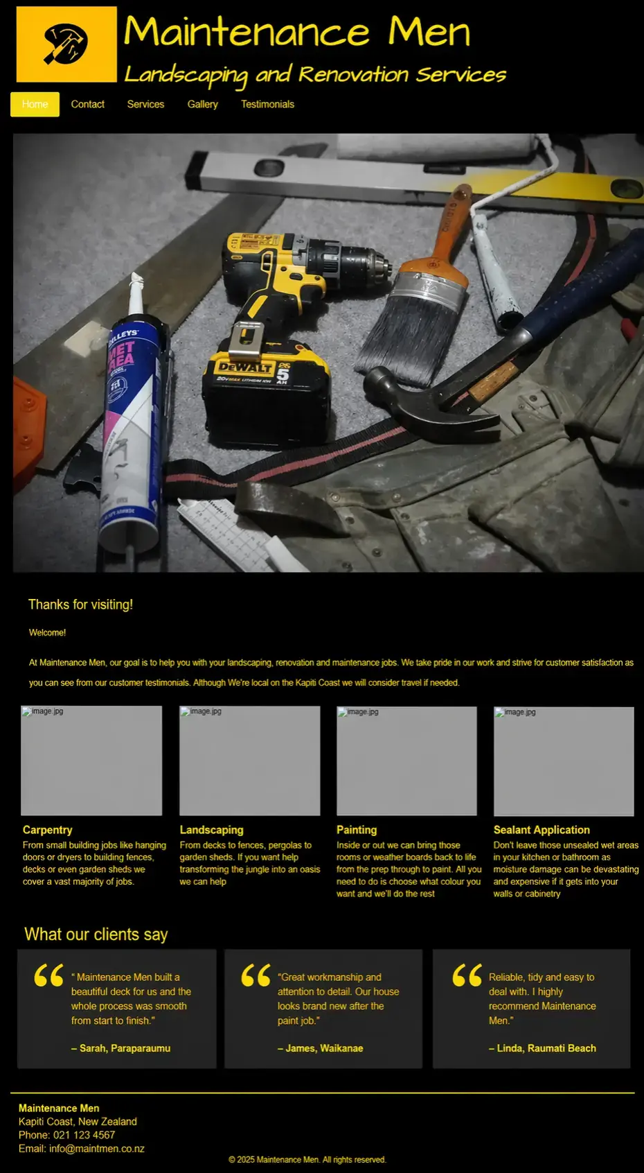
Maintmen

Maintenance services usually win with clarity and trust. This kind of refresh turns a generic homepage into something easier to scan and easier to contact.

Clearer local-service trust
Before
Before website preview for Maintmen
  • Generic structure makes the service blend in.
  • Not enough hierarchy between the core offer and supporting details.
  • Trust signals feel understated.
  • Sharper layout makes the business easier to trust quickly.
  • Service pathway feels clearer and more action-oriented.
  • The brand appears more established than before.
Visit live site ↗
Fencing

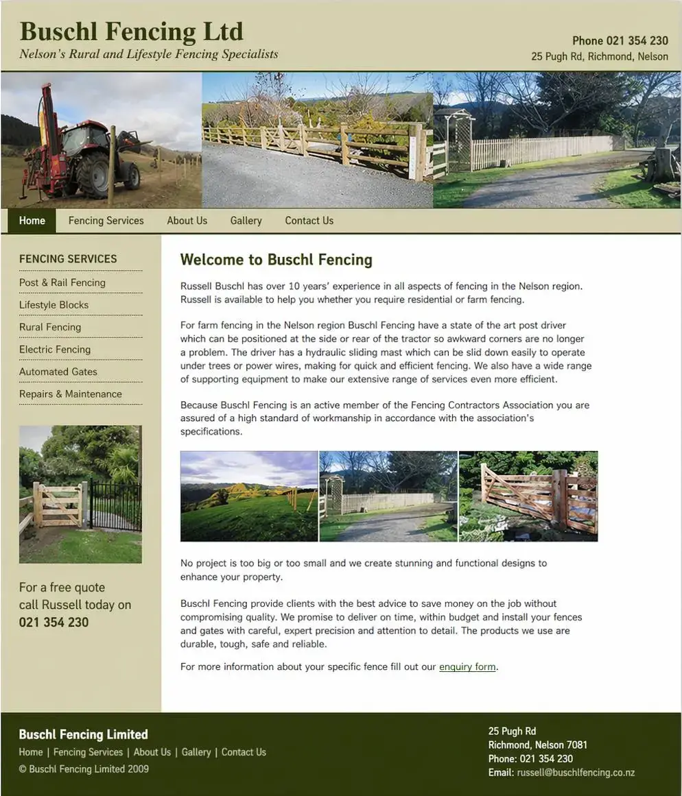
Buschl Fencing

Trade businesses like this benefit from a cleaner, more solid first impression. The goal is not flashy design, but stronger confidence and a more obvious enquiry path.

More solid trade credibility
Before
Before website preview for Buschl Fencing
  • The offer is understandable, but the brand feels less polished.
  • Project work does not feel as persuasive as it could.
  • Visual structure could do more of the selling.
  • Stronger presentation gives the business more authority.
  • Project imagery and layout work harder together.
  • The site feels more trustworthy for new leads.
Visit live site ↗
Emergency Services

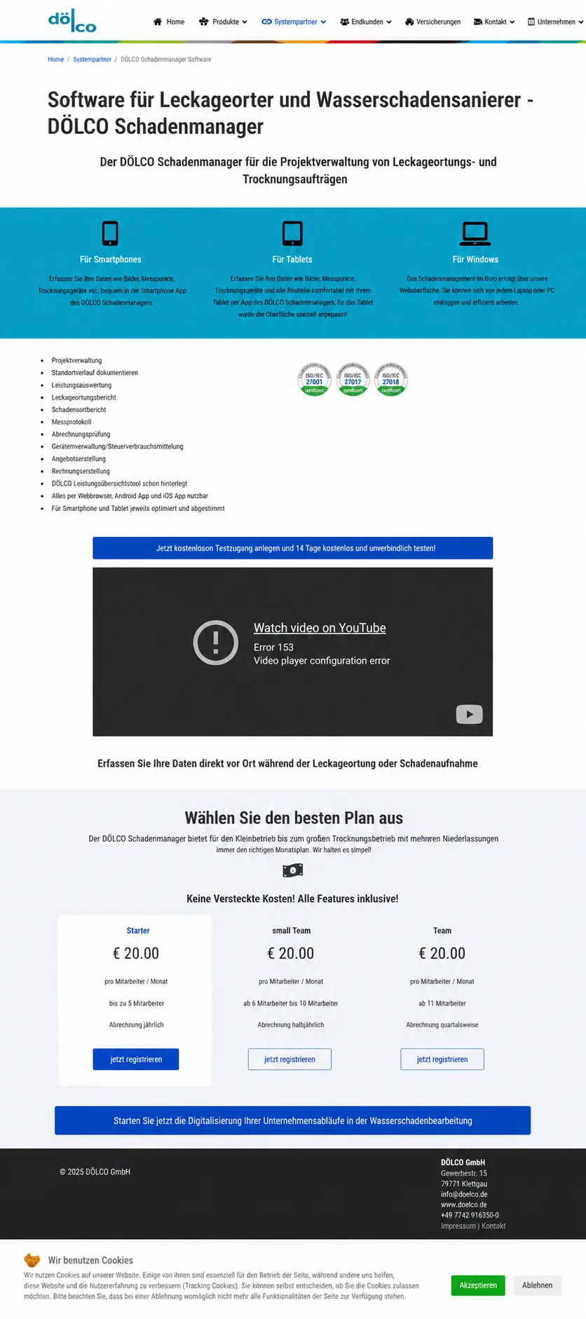
Wasserschadenmanager

For urgent-response services, the website needs to feel immediate and trustworthy. This type of rebuild improves clarity while still feeling professional under pressure.

More urgency with more trust
Before
Before website preview for Wasserschadenmanager
  • Urgency is there, but the site feels visually rough.
  • Important trust cues do not stand out enough.
  • Layout feels functional rather than confidence-building.
  • More convincing first impression for emergency-response traffic.
  • Stronger structure makes urgent actions easier to take.
  • The business feels more capable and established.
Visit live site ↗
Equipment Hire

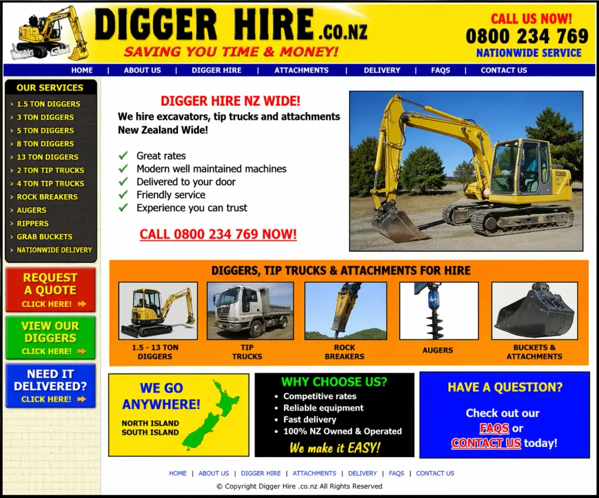
Digger Hire

Hire businesses benefit from clarity first. This comparison shows how a cleaner homepage can make a practical service easier to understand and quicker to enquire with.

Simpler, faster decision path
Before
Before website preview for Digger Hire
  • Looks functional, but not especially polished or easy to scan.
  • Rates and service details can feel cluttered.
  • The page does not quickly reassure new visitors.
  • Cleaner presentation helps visitors get to the point faster.
  • The service feels more trustworthy and easier to book.
  • Better pacing improves the enquiry path.
Visit live site ↗
Industrial / Fabrication

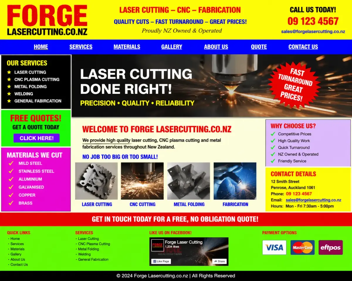
Forge Laser Cutting

For specialist industrial businesses, the goal is usually clarity and professionalism. This upgrade shows how to modernize without overcomplicating the message.

Before
Before website preview for Forge Laser Cutting
  • No dedicated website to explain services clearly.
  • Credibility depended on offline conversations and referrals.
  • Buyers had no polished destination to validate the business.
  • Sharper design makes the business feel more established.
  • Information hierarchy helps visitors find the important things faster.
  • Overall execution feels more aligned with modern B2B expectations.
Visit live site ↗
Heavy Vehicle Services

Truck Repairs Auckland

A more current design helps specialist repair services feel more dependable and easier to contact, especially when customers are looking for fast help.

Before
Greenfield project — no prior website to compare.
  • No website for operators to check before reaching out.
  • No strong online explanation of services and response capability.
  • The business needed a more credible first impression for urgent jobs.
  • Sharper structure makes the business feel more reliable.
  • Service offering is easier to understand quickly.
  • The finished design supports stronger enquiry intent.
Visit live site ↗
Testing / Industrial

RD Test

Even technical or industrial offers benefit from a cleaner front end. This example shows how structure alone can make a specialist service feel more current and more credible.

Cleaner specialist presentation
Before
Before website preview for RD Test
  • Information is there, but the page feels plain and forgettable.
  • Not enough visual confidence for a specialist offer.
  • The site could do more to support trust with cold visitors.
  • The finished layout feels more intentional and easier to trust.
  • Content hierarchy improves readability immediately.
  • The business presents as more current and capable.
Visit live site ↗
Business Advisory

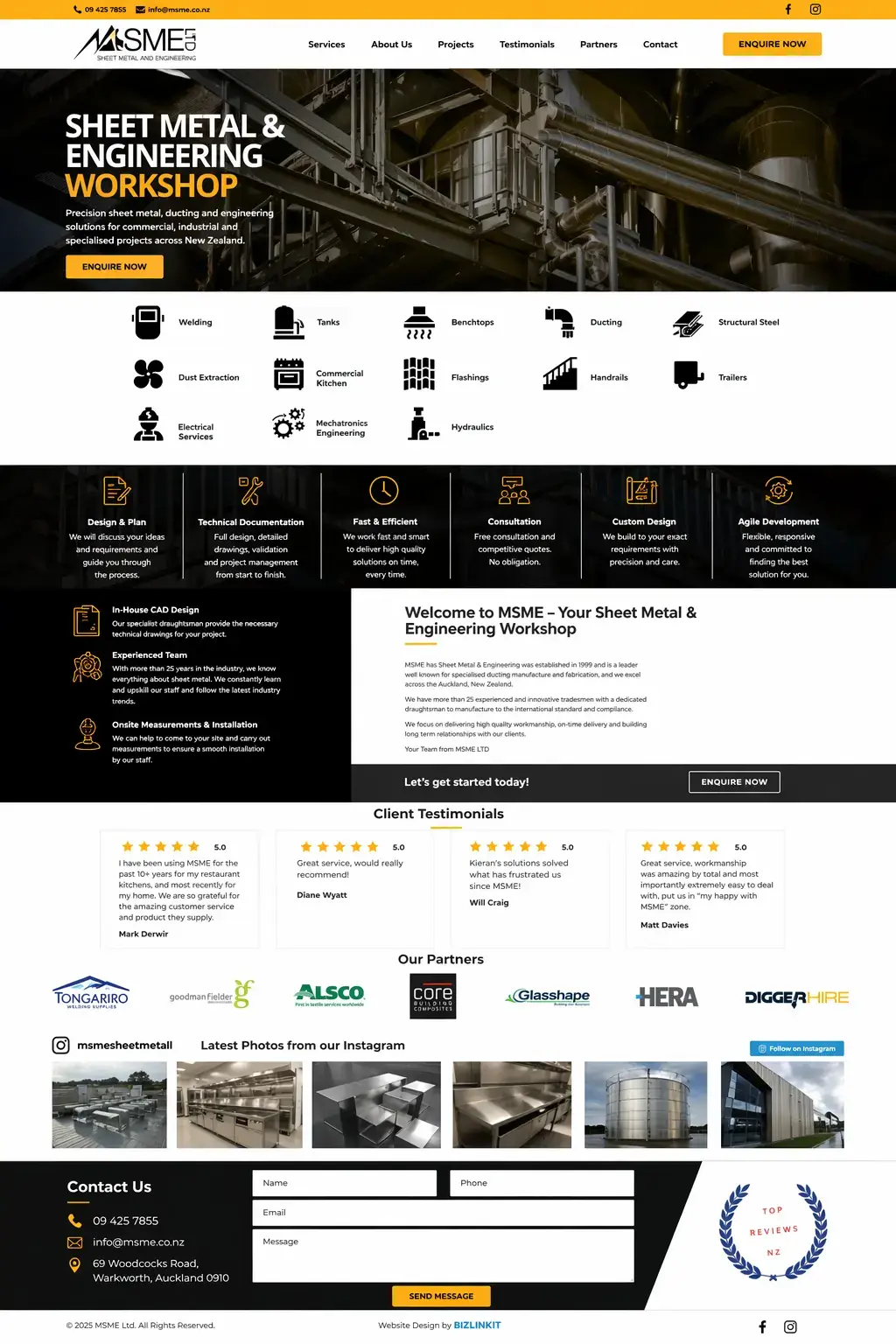
MSME

A service business like this benefits from moving away from a dense, generic brochure layout toward something clearer, more modern, and easier to trust at a glance.

Sharper advisory positioning
Before
Before website preview for MSME
  • Information is present, but the presentation feels dated.
  • Too little visual hierarchy for a professional service.
  • The brand does not feel as established as it could.
  • Cleaner composition makes the service offer easier to follow.
  • Stronger polish helps the firm feel more credible.
  • The homepage does a better job of guiding next steps.
Visit live site ↗
Legal

Access Law

Professional services need trust fast. This comparison leans into how cleaner typography, structure, and polish can make a legal practice feel more dependable.

Before
Greenfield project — no prior website to compare.
  • No website for prospective clients to review before reaching out.
  • Trust had to be built without a clear online brand presence.
  • No structured place to explain services, credibility, or next steps.
  • Calmer presentation supports seriousness and professionalism.
  • Navigation and content flow feel easier for first-time visitors.
  • Better polish helps the firm feel more established.
Visit live site ↗
Automotive

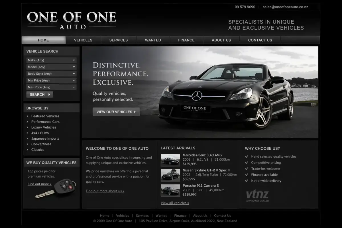
One of One Auto

For a niche automotive brand, the website has to feel distinctive. This style of rebuild helps the business feel more deliberate, current, and worth contacting.

More distinctive brand feel
Before
Before website preview for One of One Auto
  • The look is serviceable but not very memorable.
  • Brand personality does not come through strongly enough.
  • Visual confidence could be much higher.
  • More distinctive layout gives the brand more personality.
  • The site feels more current and more intentional.
  • Stronger design helps the business stand out faster.
Visit live site ↗
Automotive

Hawkes Bay Auto Removals

A practical local service can still look sharp. This example shows the jump from an “it’ll do” site to something more trustworthy, clearer, and easier to act on.

Before
Greenfield project — no prior website to compare.
  • No website for customers to review before making contact.
  • No clear online explanation of the service and coverage area.
  • The business needed a more legitimate first impression from day one.
  • Offer is easier to understand quickly from the homepage.
  • Trust signals and layout clarity support faster enquiries.
  • The business feels more legitimate before the first call.
Visit live site ↗
Why these rebuilds work

Most of the lift comes from clarity, trust, and presentation.

It's rarely about radical reinvention. It's about removing the visual noise, sharpening the positioning, and getting the proof and CTA where customers expect to find them.

Want a rebuild like this?

Let's talk through what your before-and-after could look like.

We'll walk you through which pieces of your current site are quietly costing you enquiries — and what a credible rebuild would actually involve.

Book intro call